Branding · visual identity

Visual identity that holds up, not just a good-looking logo

We build the brand as a system: logo, colours, typography and rules of use, documented in a brand book anyone can follow.

A good logo applied inconsistently builds nothing. The difference between a company that looks established and one that looks improvised is consistency, not design budget.

We reply the same working day. No obligation.

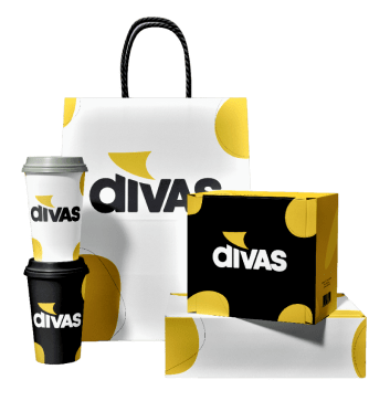
Divas visual identity items: brand book, business cards, branded cup, Pantone swatches, pen and seal
12 years
building brand identities
120+
projects delivered
4–8 weeks
for a complete identity
3+ years
average client relationship
Situations

Three moments when a brand needs work.

01

You are starting out

You have the company and the service, but nothing visual. You need a correct foundation, not a logo made quickly that will have to be redone in a year.

02

The company grew, the image stayed behind

You sell something different, to different customers, at a different price point. The image still tells the story from five years ago.

Buyers compare before they call, and the first impression decides before you get to speak.

03

Every material looks different

The logo in three versions, different colours on the site and in proposals, fonts chosen by whoever made each file.

Benefits

A system, not just a logo

Colours, typography, rhythm and rules of use — everything that makes your materials look like one family.

Applied, not just presented

You see it on the real materials: website, proposal, email signature, social, packaging.

A brand book people actually use

Clear rules, written so anyone can follow them, including an external supplier.

Designed for digital

Tested at small sizes, on dark backgrounds and in one colour, where most logos fall apart.

What you get

What an identity project includes.

A brand is judged by how it looks applied, not by how it looks on a presentation board.

  • A positioning conversationWhat you sell, to whom, what sets you apart and how you want to be perceived. Design follows the answers, not the other way round.
  • Competitive visual analysisHow your market looks, so you do not resemble everyone else by accident.
  • Concept directionsTwo or three genuinely distinct directions, not twenty variations on one idea.
  • The logo in every versionPrimary, secondary, symbol, dark-background and single-colour variants.
  • A colour paletteWith values for print and screen, plus contrast rules for accessibility.
  • A typographic systemFont families for headings and body text, with defined hierarchy and sizes.
  • Graphic elementsIcons, textures, shapes or illustrations that extend the identity beyond the logo.
  • Real applicationsBusiness card, email signature, proposal template, social formats, website mock-up.
  • A brand bookThe document with all the rules: what is allowed, what is not, with correct and incorrect examples.
  • Source filesYou receive everything, in editable formats. You can work with any supplier from that point on.
Types of project

How far we take it.

Logo and core identity

The logo in every variant, palette, typography and a short usage guide. Suited to companies starting out.

2–4 weeks

Complete visual identity

The whole system, with graphic elements and applications across the materials you actually use.

4–8 weeks

Rebranding

You already have a known brand. We modernise it without losing the recognition you have built — evolution, not rupture.

6–10 weeks

Brand book

Documenting an existing identity so it is applied consistently by everyone, including external suppliers.

2–4 weeks

Sub-brand identity

A new product line or division that has to be distinct while visibly belonging to the same family.

3–6 weeks

Brand materials

Presentations, proposals, catalogues, packaging and event materials, built on the existing identity.

per project

Process

Five steps, with decisions taken at the right moment.

01

Positioning

A conversation about the business, not about favourite colours. What you sell, to whom, what sets you apart.

02

Research and directions

We analyse the visual market and propose two or three distinct directions, each with its own argument.

03

Developing the chosen direction

One direction, taken all the way. This is where it gets refined, not where the course changes.

04

System and applications

Colours, typography, graphic elements and the identity applied to real materials.

05

Brand book and handover

The rules document plus all source files, and a session explaining how they are used.

Approach

A brand is a system, not a drawing.

The logo is the most visible part but also the smallest. What actually shifts perception is consistency: the same colours, the same typography, the same rhythm, across every material, for years.

How we build

Complete visual identity

We start from positioning, not from aesthetic preference. What you sell, who you address, what you compete against and how you want to be perceived — all of that determines the visual direction. Only then do we draw. A brand built the other way round looks good in the presentation and fails at the first real application.

  • Positioning before aestheticsDesign is a business tool, not a matter of taste. We argue every choice.
  • Tested where logos failSmall sizes, dark backgrounds, single colour, embossing. If it survives there, it survives anywhere.
  • A system anyone can applyRules clear enough that an external supplier cannot break the consistency.
  • Optimised for digitalContrast checked for accessibility, lightweight SVG files, interface variants.
  • Documented, not just deliveredThe brand book is what separates a brand that holds from one that falls apart in six months.
  • The source files are yoursYou receive everything in editable formats. You do not depend on us to use what you paid for.

We apply the identity to the materials you actually use: website, proposal, email signature, presentation, social. A brand is validated in use, not on a presentation board.

Worth knowing: branding does not fix a product or a pricing problem. It makes a good product taken seriously — it does not turn a weak one into a good one.

Rebranding

Evolution, not rupture

When a brand is known, changing everything destroys the recognition you have built. We keep the elements the market associates with you and modernise the rest.

Suited to companies with history that have outgrown their current image.

Brand book

The rules, written down

The document that says what is allowed and what is not, with correct and incorrect examples. Without it, an identity degrades within months.

Suited when you work with several suppliers or have an in-house marketing team.

Digital identity

The brand applied in the interface

Extending the identity into interface components: buttons, forms, states, icons. The bridge between the brand book and the website.

Suited when a new site or application is coming next.

Comparison of the technologies we use to build websites
Logo onlyCore identityComplete identityRebranding
Logo in every variantyesyesyesyes
Palette and typographynoyesyesyes
Graphic elementsnolimitedyesyes
Applied to materialsno2–3 materialscompletecomplete
Brand booknoshort guidecompletecomplete
Timeline1–2 weeks2–4 weeks4–8 weeks6–10 weeks

Our rule: We do not recommend a logo on its own unless the budget genuinely requires it. A logo without a system and without rules gets applied inconsistently from the first proposal you send, and the investment is lost. The minimum that holds over time is a core identity.

Consistency

A brand falls apart in application, not in concept.

Most identities look good at the presentation and poor six months later. The cause is always the same: nobody wrote the rules, and every material was made by someone else, differently.

Rules written, not assumed

Which colour on which background, how much space around the logo, which font for which level.

Correct and incorrect examples

The most effective chapter in any brand book. It shows exactly what not to do.

Files ready to use

Every format, clearly named, so nobody has to improvise an export.

Applied to real materials

Handover includes the materials you use daily, not only presentation boards.

A visual identity applied across brand materials

A concrete example: the identity of this site — one accent colour, one typographic family, one consistent spacing system. Simplicity is what makes a brand easy to apply correctly.

Projects

We do not promise. We demonstrate.

Brands and materials built by our team.

View full portfolio
Project delivered by Divas Agency
Interface developed by Divas Agency
Platform developed by Divas Agency
Dr. Excel project developed by Divas Agency
Digital project developed by Divas Agency
Responsive project developed by Divas Agency

Frequently asked questions

How is the price set?

We work on an hourly rate: €50 per hour, excluding VAT. The price comes from the number of estimated hours rather than from a fixed package. You receive a proposal in which each module carries its estimated hours and cost.

How long does a visual identity take?

A logo with a core identity takes 2–4 weeks. A complete identity with applications and a brand book takes 4–8 weeks. A rebranding takes 6–10 weeks. The timeline depends heavily on how quickly decisions come from your side — design waits for feedback.

How many logo options do I receive?

Two or three genuinely distinct directions, each with its own reasoning, rather than twenty variations on one idea. You choose a direction and we take it all the way. Refinements are included; changing direction completely after approval is estimated separately.

Do I receive the source files?

Yes, in full and in editable formats. You do not depend on us to use something you paid for. It is also why we work hard to make the brand book clear: we want it to be applied correctly by anyone.

What is a brand book and why do I need one?

The document that says how the identity is applied: which colour on which background, how much space around the logo, which font for which kind of text, with correct and incorrect examples. Without it, every material will be made differently and the identity falls apart within months.

I already have a logo. Can you work with it?

Yes. We either build the system around it — palette, typography, rules, applications — or modernise it while keeping recognition. We tell you honestly whether it is worth keeping or holding you back.

Do you build the website afterwards?

Yes, and we recommend the same supplier for both. An identity is only validated once it is applied. See the web design page.

What is rebranding and when is it needed?

Modernising an existing identity without losing the recognition you have built. It is needed when the company has outgrown its image, when you are addressing a different segment, or when the visuals make you look smaller than you are.

Do you produce printed materials as well?

Yes: business cards, folders, catalogues, packaging and event materials. They go into the estimate as separate modules with their own hours, so you can choose only what you actually use.

How do you decide colours and fonts?

From positioning and from your market, not from preference. We analyse how competitors look, so you do not resemble them by accident, and we check contrast for accessibility. Every choice comes with its written reasoning.

Estimate

Tell us what you need. We reply with an estimate.

Five steps, under two minutes. The more context you give us, the closer the estimate will be to reality.

ProjectStep 1 din 5

What would you like us to build?

You can pick more than one.

Tell us how you want to be perceived.

You do not need to know which colours or which style suit you. Tell us what you sell, to whom and who you compete with. We reply with the direction we recommend and the estimated hours.

Get an estimate

Or email us directly: contact@divasweb.ro+40 755 336 514

Get a quote